SBS Global
Design System.
A ‘Universal design system’ for Sopra Banking, a single source of truth serving multiple products and regions, built mobile-first with accessibility and RTL support.
- Client
- SBS products from Spain, France, Belgium and Dubai
- Team
- Five designers across Spain, Belgium, the UK and Dubai
- Scope
- Tokens, components, docs
- Platforms
- Responsive web and mobile
- Live docs
- Zeroheight
A company built by acquisition, and an interface that showed it.
Sopra Banking Software was part of Sopra Steria. It had grown by buying banking software companies in different countries, so its products looked and worked differently from each other.
The importance of great design has gained traction throughout the company, and a project was launched to create a 'Universal design system' to be used throughout Sopra Banking products. The benefits of creating such a system are:
- Products would be easily identifiable as SBS products
- A single source of truth for all design
- Design could be done at speed by all our different businesses, using easily identifiable components
The Universal Component Design system project was launched in October 2020. I led the design side of it, running a team of five designers based in Spain, Belgium, the UK and Dubai. Four countries, three time zones, one eight-week build.
Methodology:
- Double diamond
- Agile sprints
- Kanban structure in stand-ups
Tools used:
- Figma
- Zeroheight
- Notion
- Miro
Deliverables:
- Design audit created from four of our products
- Figma file containing all the components and styles
- Zeroheight link containing the design principles, style and component documentation
The eight-week plan
- Identify components used across products
- Define lists of components to design
- Define structure of pattern library
- Define design principles
- Define design direction routes
- Establish design direction (look and feel)
- Test designs on product screens
- Set up pattern library environment in publishing tool
- Set up pattern library navigation and page structures
- Start documentation of components
- Iterate look and feel
- Create small set of initial components
- Complete documentation for those components
- Test designs on product screens
- Iterate look and feel
- Design a wider set of components
- Continue documentation
- Test designs on product screens (2 screens only)
- Iterate look and feel
- Design a wider set of components
- Continue documentation
- Test designs on product screens (2 screens only)
- Finish design of remaining components
- Finish documentation
- Tidy up inconsistencies in design or documentation
- Ensure the library is ready for handover
Governance for the pattern library was defined in parallel with the design work, not after it.
One source of truth, usable across multiple products.
The aim of this project is to create a 'Universal design system' that is a single source of truth, which can be used across multiple SBS products. Following the mobile-first approach, it has been decided that the components will be designed as responsive while taking into consideration accessibility.
A single set of styles
One product design pattern library holding a universal set of styles, rather than a library per product.
Guidelines beside it
An accompanying set of guidelines to promote consistency, so the system holds without us in the room.
Inclusive by default
Mobile-first, responsive, accessible, and working in right-to-left as well as left-to-right.
Double diamond.
The Double Diamond is a design process model developed by the British Design Council in 2005. It divides work into four phases: Discover, Define, Develop and Deliver, and its defining feature is the emphasis on divergent and convergent thinking: many ideas are created, then refined and narrowed to the best one. That happens twice, once to confirm the problem definition and once to create the solution.
The value of the model on this project was permission. It gave me a shared language for why the first two weeks produced no designs, which is the hardest fortnight of a design system project to defend.
We counted what was actually there.
- Timeline
- Two weeks assigned to complete discovery.
- What
- Four SBS products were identified with key stakeholders, on which we would conduct a component audit.
- How
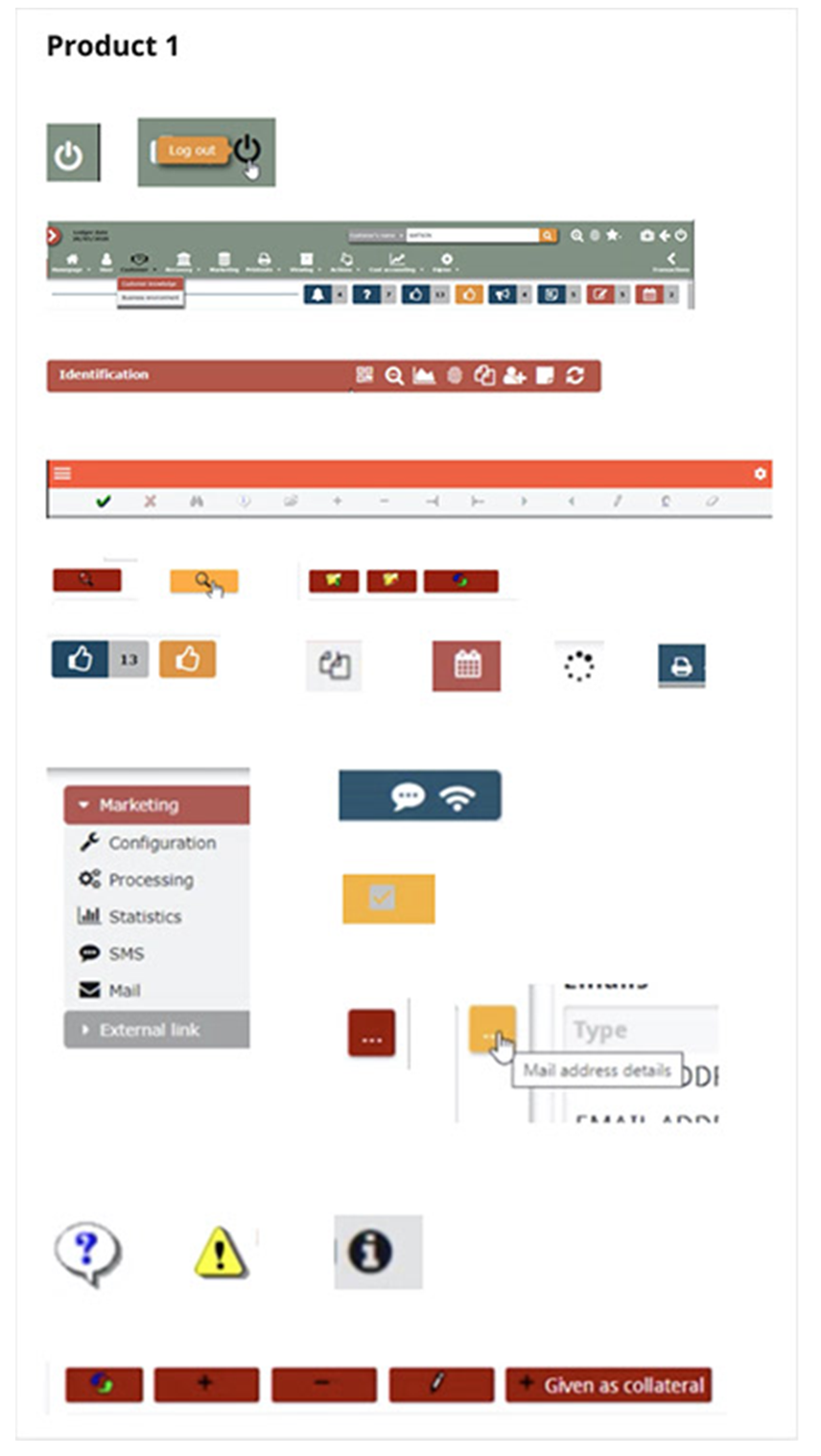
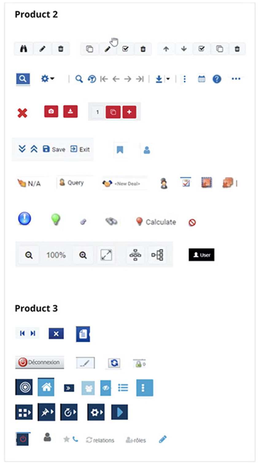
- With each product owner’s permission we went through every product and screenshotted every component we found on every page.
- Result
- More than 700 different components, laid out together in Miro.
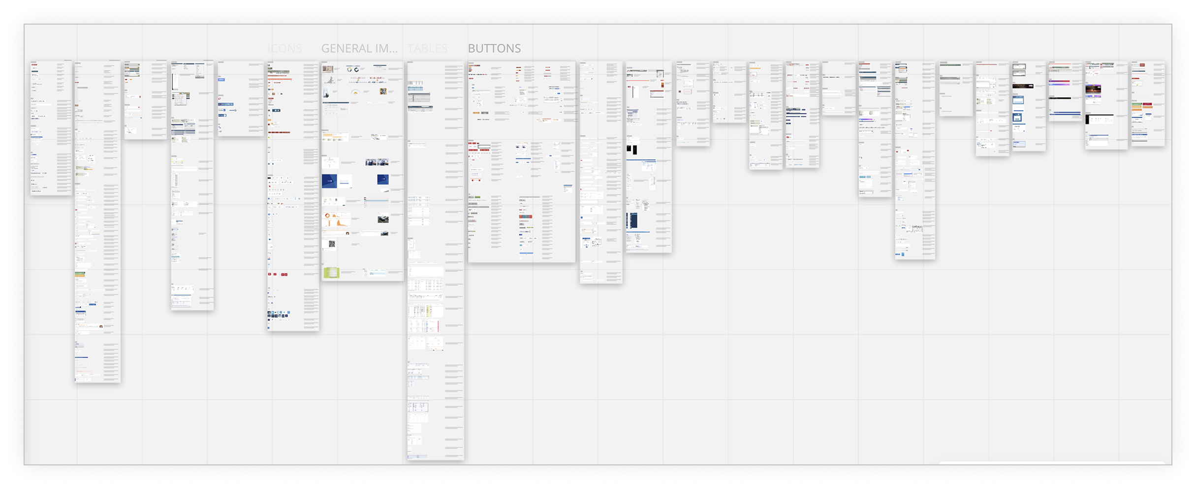
Example: the same icons across different products
Every principle answers a problem we found.
I ran workshops with key stakeholders to identify the foundations and principles our designs would be based on. Each principle exists because of a specific failure we could point at in the inventory, which made them easy to defend later when a decision was contested.
Design style
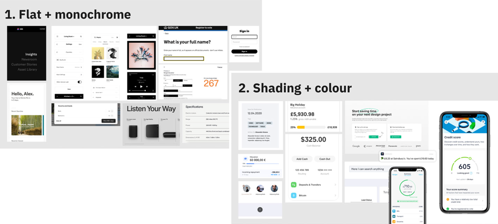
We built moodboards to identify which style to adopt: flat and monochrome, or shading and colour. The result was a combination of both — flat and minimal, with shading and colour used to carry meaning rather than decorate.
Treat Arabic and right-to-left as a foundation, not a localisation phase.
SBS ships to Dubai. Arabic sat on the plan as a later phase, the way localisation usually does, build the system, translate it afterwards.
I moved it to the front. Mirroring is not translation. It changes component anatomy, icon direction, number and date formatting, the reading order of a table, where a calendar’s navigation controls belong, which side an error attaches to. Retrofitting that into a finished library is not an adjustment, it is a rebuild.
It cost us a little time per component. It saved the system from being unusable in one of its four markets.
Ship the English system, handle Arabic as a localisation workstream later.
Made RTL a condition of a component being finished. No component was signed off without its mirrored variant documented.
Two-week sprints, reviewed daily.
Working in two-week sprints, we organised the work using Kanban in our daily stand-ups, and held weekly feedback sessions with key stakeholders to make sure we were progressing in the right direction at speed.
UX focused on each individual component, fleshing out its functionality and feeding requirements back to UI, who were fast followers in designing components against those requirements. At the end of each day the team reviewed the components designed, checking they fulfilled everything asked of them.
Rebuild the foundations before touching a single component.
The instinct in the room was to start with buttons. They are visible, they demo well, and after a 700-component audit everyone wants to see the pile shrink. Instead, I spent the first sprint on type scale, spacing, grid and colour. We could not get down to 21 components until we agreed what a component was made of. Otherwise we would only have fixed the surface of the inconsistency and left the cause in place.
Once the foundations were fixed, component work moved faster than the schedule assumed, because every decision inside a component had already been made once.
Start with the most-used components and show visible progress in week one.
Spent the whole first sprint on tokens, type and spacing, and explained why the visible progress comes later.
The first mock-up and style tile
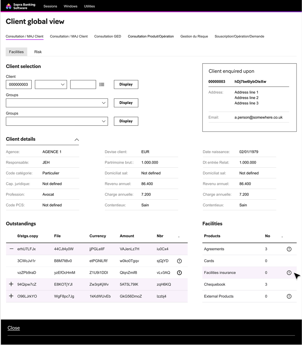
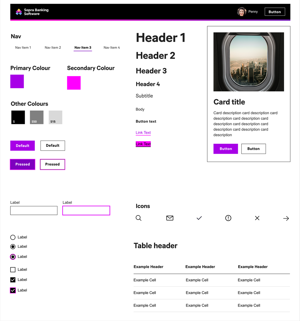
What we handed over.
- 21 fully formed, fully functioning responsive components with full CSS styling.
- A full set of responsive grids for desktop, tablet and mobile screens.
- Full documentation of each component and its states, with how and when to use it, alongside the foundations and design principles.
That formed the foundation of a universal design system for SBS. Components would continue to be added as new projects and products identified missing functionality, which is why the governance model mattered as much as the components did.
Make Zeroheight the source of truth, not the Figma file.
A Figma library is a source of truth for the people who open Figma. Engineers in four countries mostly do not.
So the published documentation became the system, and Figma became one of its inputs. Each component was documented with usage guidance, code, native behaviour and its right-to-left variant on separate tabs of the same page — so a developer, a designer and a product owner could all arrive at the same place and each find the answer they came for.
Governance was defined in parallel with the design work rather than after it, so a route for contribution existed before anyone needed one.
Hand over a well-organised Figma library and a set of slides.
Published to Zeroheight as the canonical reference, structured around who is reading rather than how the file is built. It is still live.
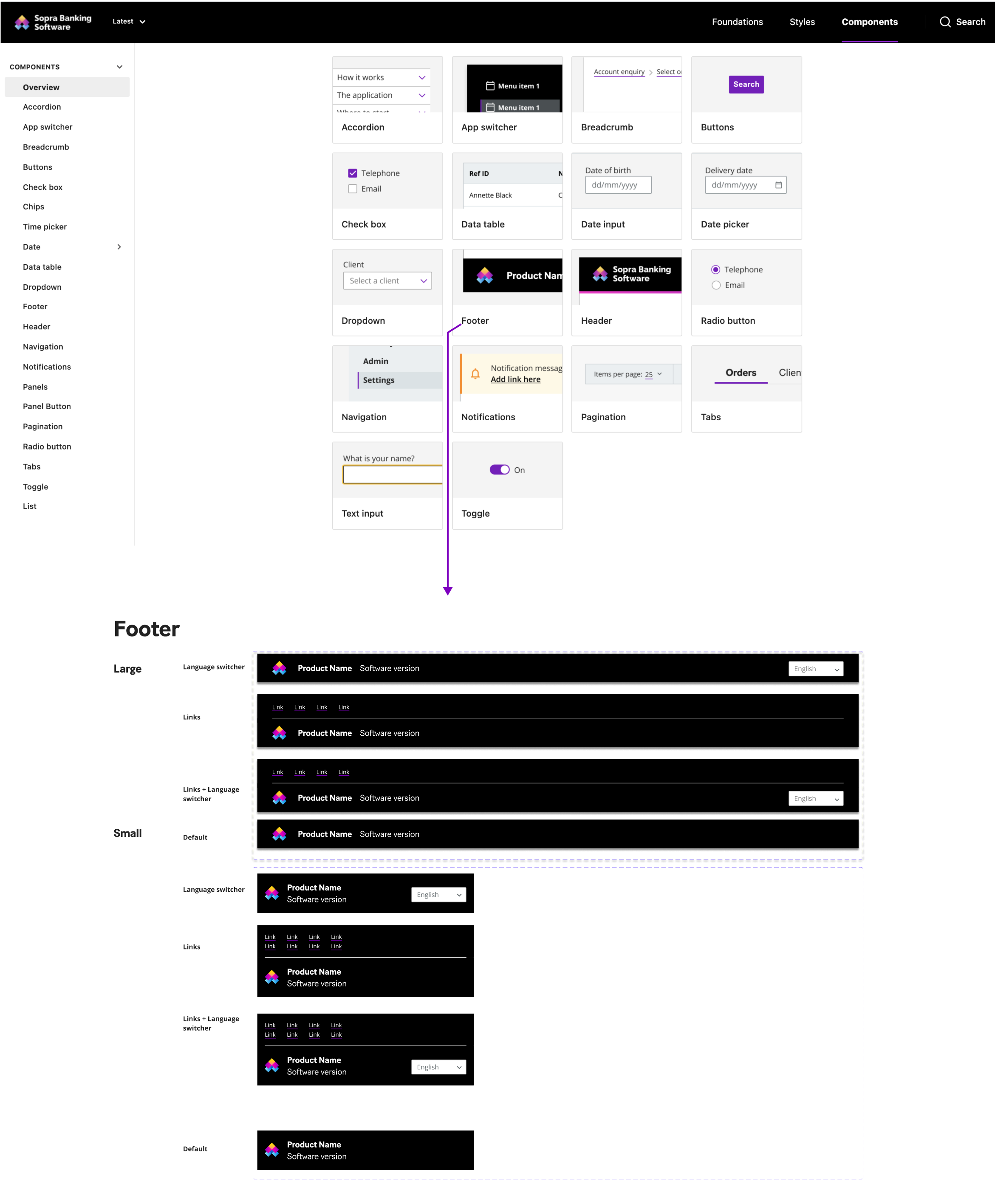

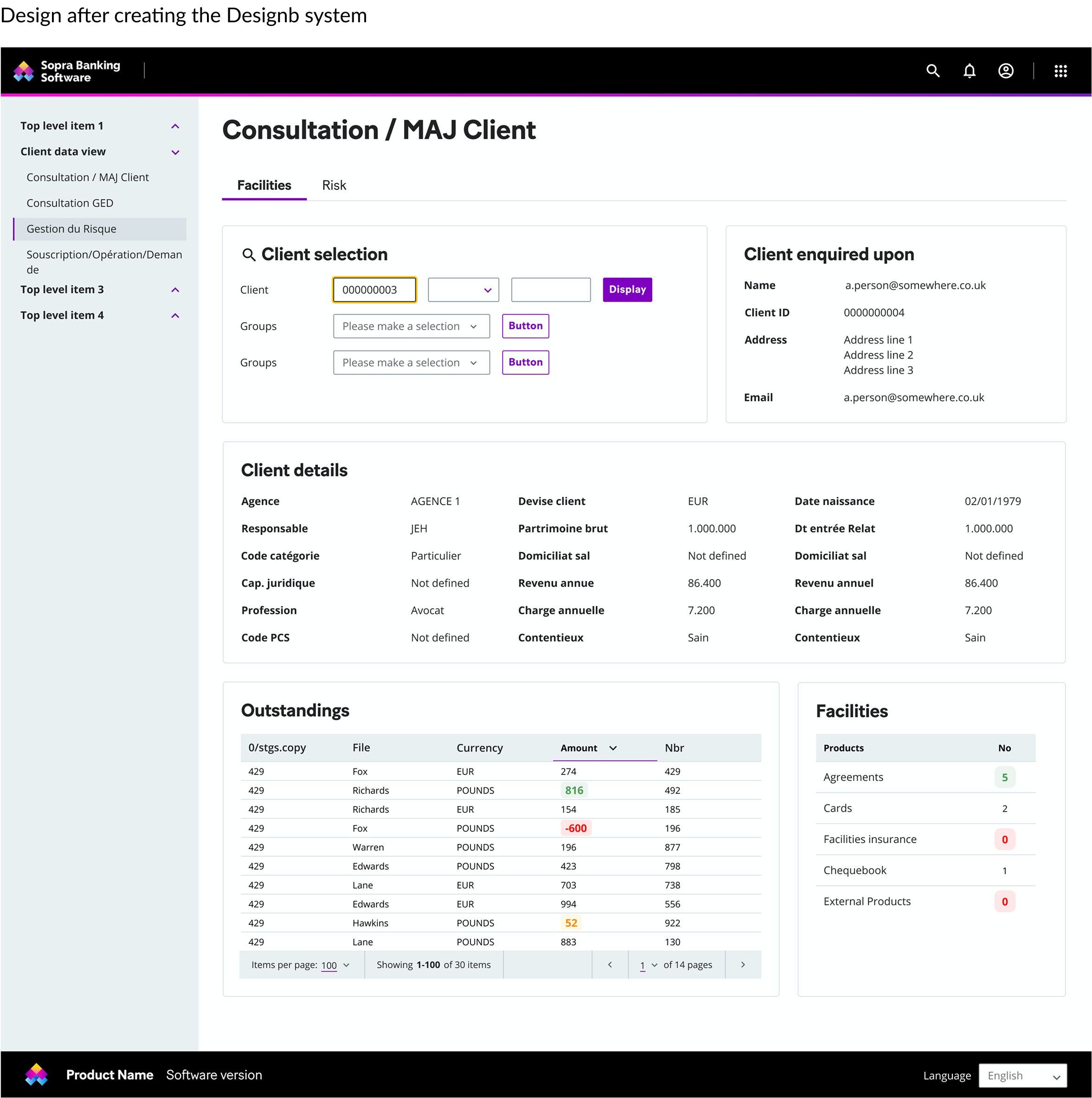
Example of one product screen
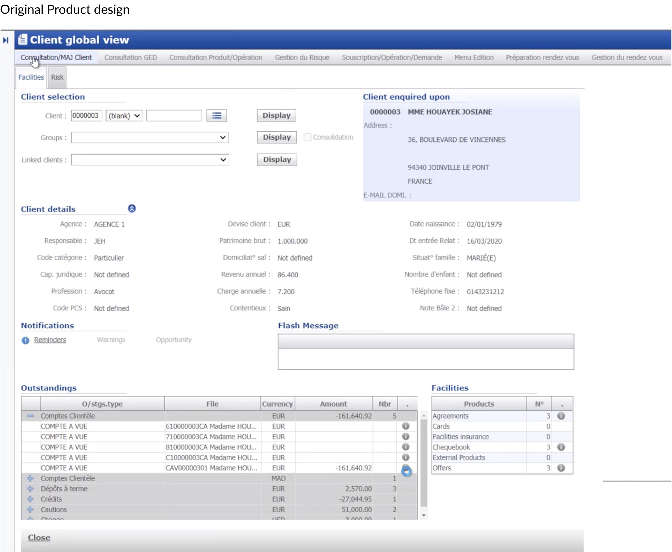
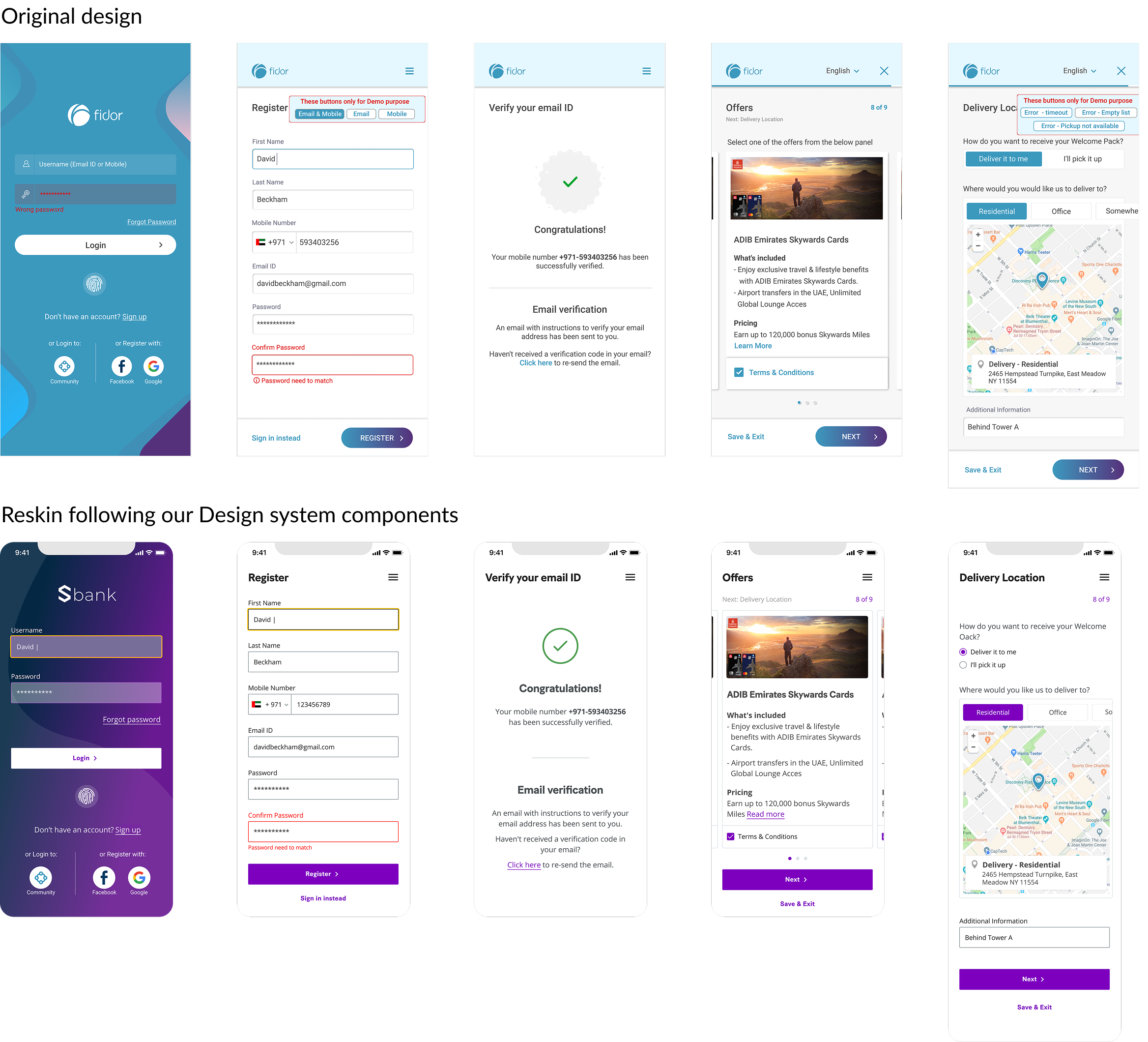
Onboarding redesign.
A system is only true when someone else builds with it. We reskinned Fidor’s onboarding flow against the design system components, on mobile and desktop, using the real flow rather than a sample screen.
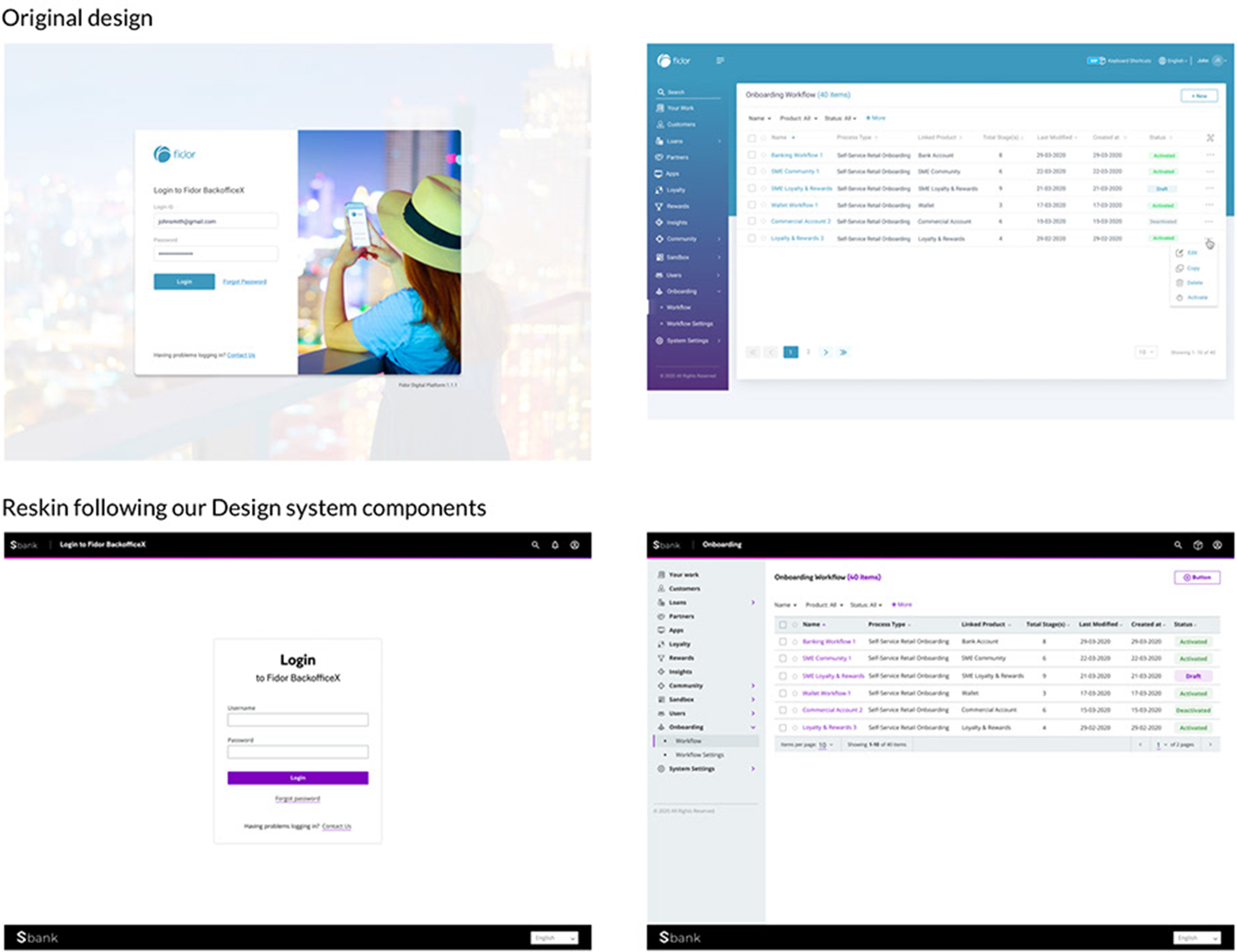
Admin portal redesign
SAB redesign.
A second acquired product, running on the same components: marketing pages, login, transfers, account summaries. Different content, different density, same system.

Android and iOS, matched to the system.
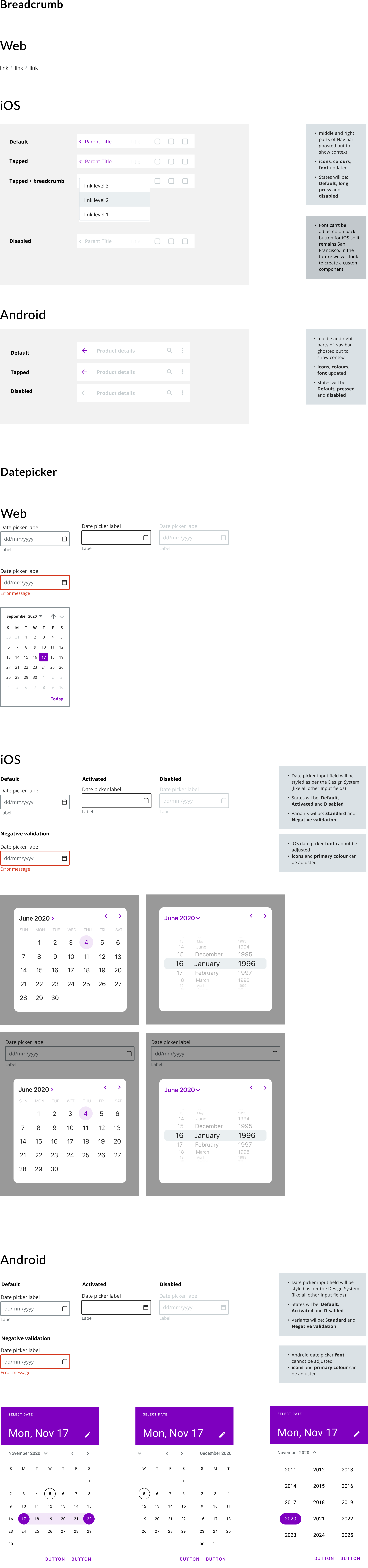
Each component was specified for web, iOS and Android. Where a platform would not bend, we documented the constraint rather than pretending it away — iOS holds San Francisco on a back button, Android fixes its date picker font, and a system that ignores that produces specs nobody can build.
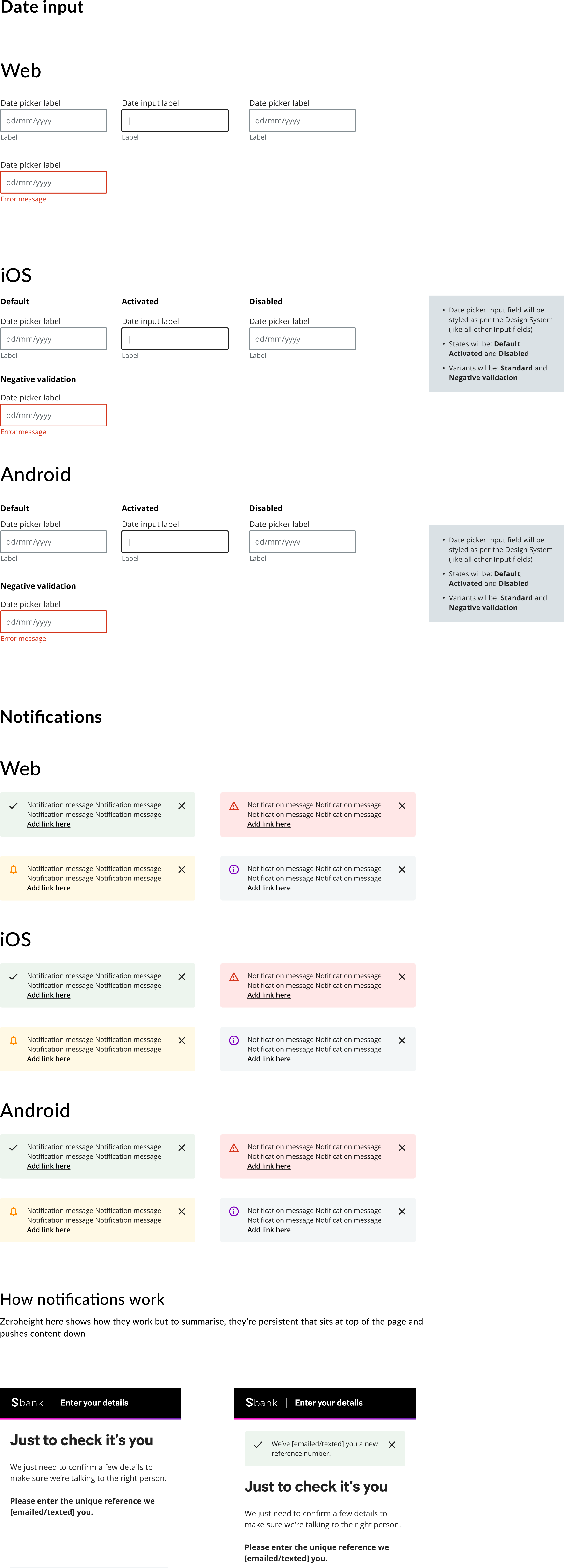
Arabic components, documented in Zeroheight.
This is what the RTL decision produced. Every component carries a right-to-left tab alongside usage, code and native — not a note saying Arabic is coming, but the mirrored component with its own anatomy, states, variants and error handling.


