Coremont Clarion
Design System.
A reusable component library for the portfolio management software used by hedge funds and asset managers, replacing inline CSS with a single source for every UI primitive in the product.
- Product
- Clarion, Coremont’s portfolio management software
- Users
- Hedge funds and asset managers
- Scope
- Foundations, components, dark theme, documentation
- Documentation
- Clarion docs — client access only
A product where every element is a detached instance is a product no one can update with confidence.
Clarion is Coremont’s portfolio management software, used by hedge funds and asset managers across fixed income, currencies, equities and commodities. It is dense, professional software where people make consequential decisions quickly.
Over time the front end had accumulated technical debt. UI elements were difficult to maintain, with inline CSS in some cases, and behaviour and look and feel were inconsistent across the application. The visible symptom is an interface that feels slightly different from screen to screen. The real cost is that every change is more expensive than it should be, and nobody can be sure what else it will break.
The Clarion UI Kit launched in October 2022 to address this. It is a reusable component library that became the single source for all UI primitives across the product.
Five benefits, agreed before any component was drawn.
A design system inside a commercial product competes for engineering time with features clients are asking for. So the kit was framed around five benefits, written down and agreed at the start.
Process and delivery phases
The work was structured as three milestones, defined in the initiative brief and tracked as Jira epics.
Foundations
Colour palette, typography and icon primitives. Everything downstream would consume these, plus an initial set of components in Figma.
Clarion Kit components
The wider component set: layout, inputs, selection controls, pickers, buttons, feedback, disclosure and overlays.
Dark theme
A dark theme across the kit, which meant re-examining every component already shipped.
The palette, the type scale, the icons before anything else.
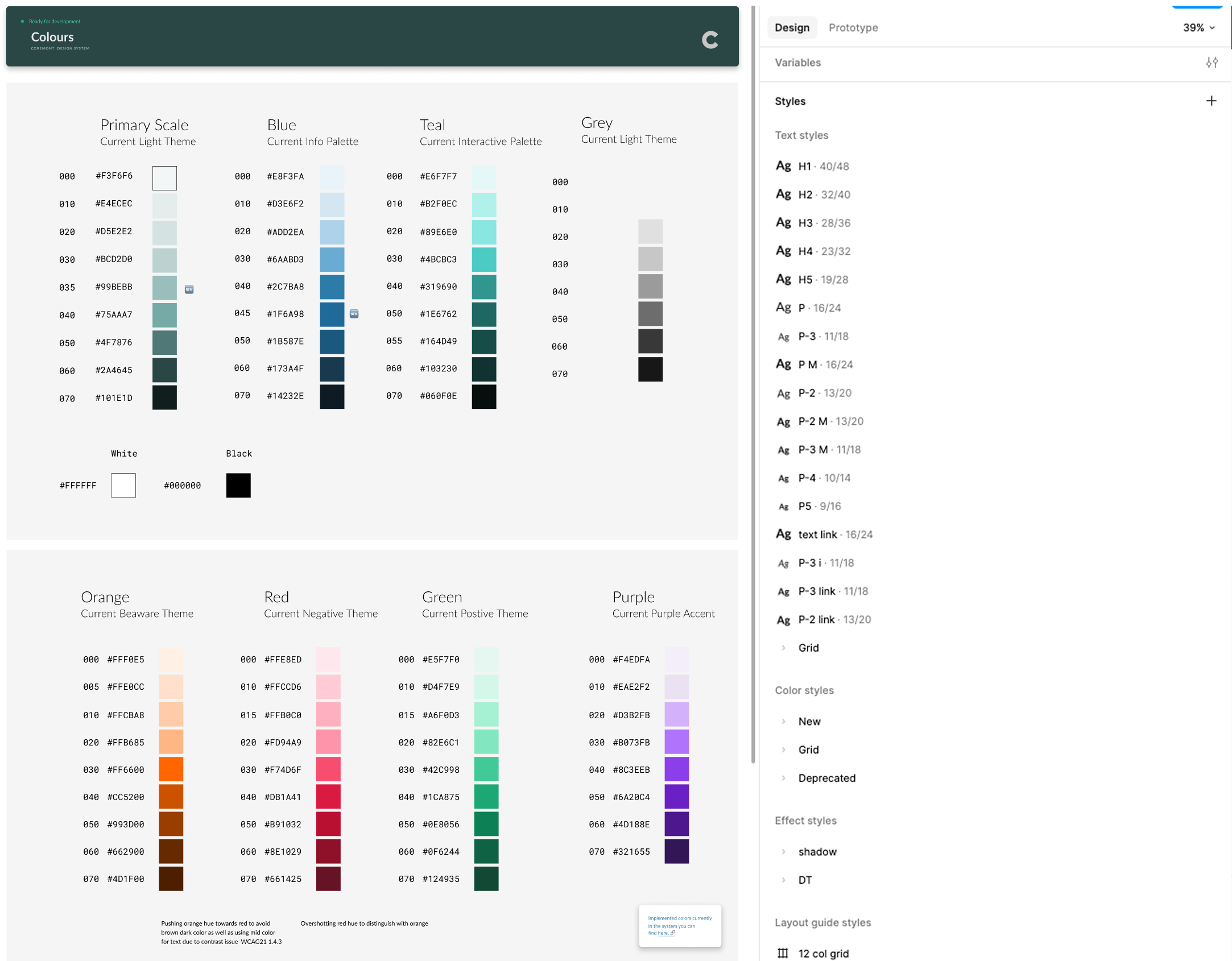
The first milestone built what everything downstream would consume: a colour palette organised as scales rather than named swatches, a type scale, and icon primitives. Each colour family carries a defined role: a primary scale, blue for information, teal for interactive, orange for warning, red for negative, green for positive, with steps numbered so a component references a position in a scale rather than a hex value.
That numbering is the part that matters later. A component asking for step 040 of the negative scale keeps working when the scale changes underneath it. A component asking for a literal hex value does not.
Forty-five components, every state specified.
The second milestone produced the wider component set. The inventory documented in the brief covers roughly forty-five components across eight groups.


Old design, new design.
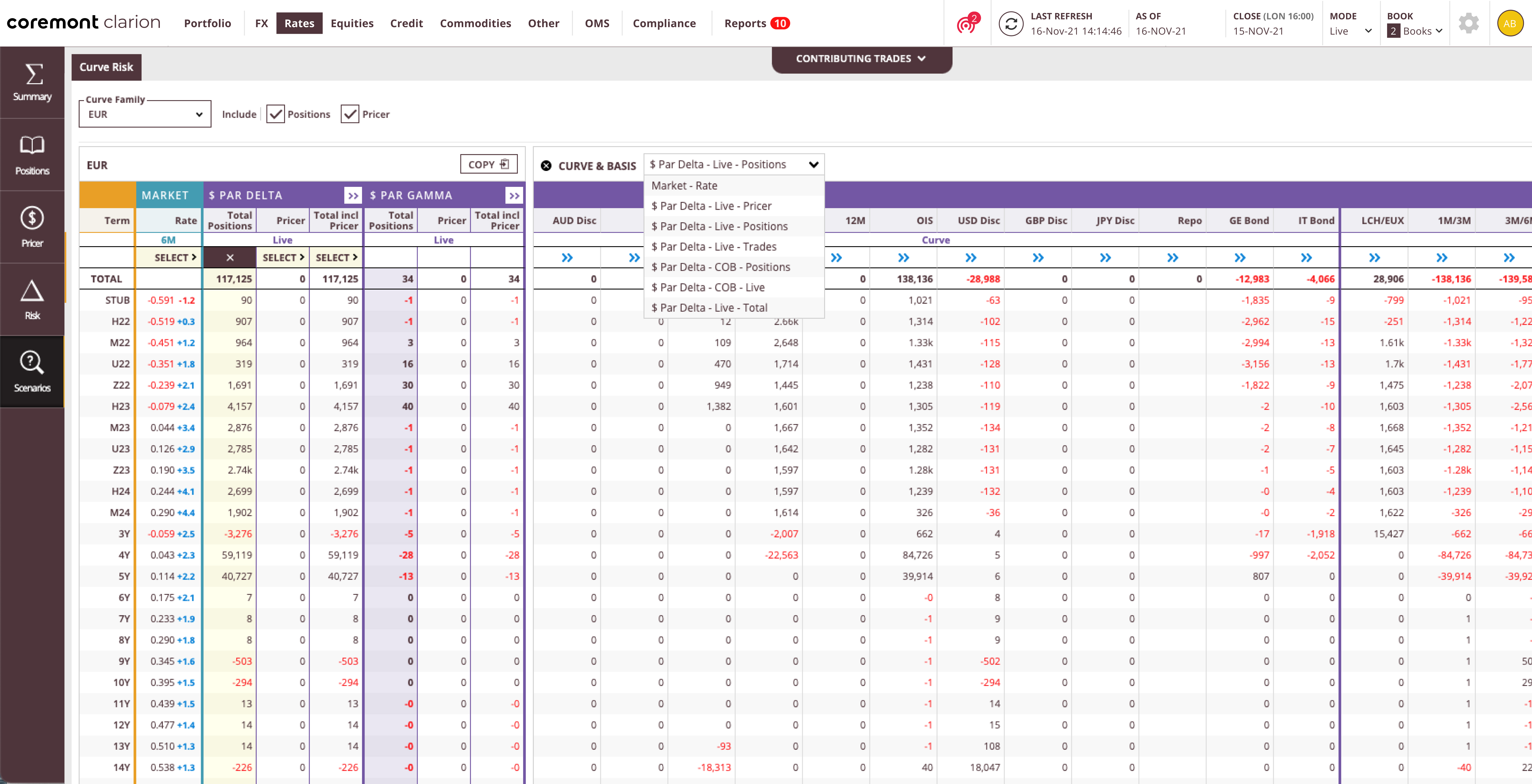
The same Rates view before and after. The old screen carried its own colour scheme, inline controls and table styling; the new one uses the kit: the same navigation, form controls and tables as every other screen in Clarion.

Dark mode as an audit, not a skin.
The third milestone added a dark theme to the kit. It is the milestone that sounds like a visual exercise and is not.
Make dark theme its own milestone, so it forces the tokenisation honest.
Dark mode is usually treated as a nice-to-have and bolted on at the end, or handled per screen as teams get to it.
Giving it a milestone of its own meant every component already shipped had to be re-examined: any colour value referenced literally rather than through a token simply would not work in dark mode. There is no way to fake it and no way to defer it. The theme is a test the whole library either passes or fails.
So the real output of milestone three was not a dark theme. It was proof that the token layer built in milestone one was actually being used, which is the thing every design system claims and few can demonstrate.
Add dark mode later, screen by screen, once the light theme is finished and adopted.
Scheduled it as a milestone, using it to audit every shipped component for proper tokenisation.


Written for the people using the product, not just the people building it.
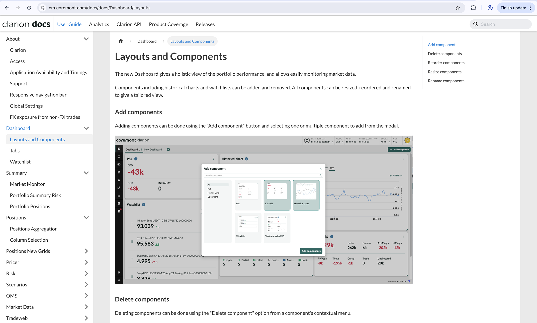
Alongside the kit we shipped a documentation site branded as Clarion docs, available to Coremont clients with login credentials. It documents each component, its states, and how and when to use it, and it explains Clarion’s feature areas across Dashboard, Summary, Positions, Pricer, Risk, Scenarios, OMS and the rest.
Document the components and the product in the same place, for the same audience.
Component documentation usually lives in one place for designers and engineers, and user documentation lives somewhere else entirely for clients. Two sites, two tones, two maintenance burdens.
Clarion docs holds both, and it is written for the client rather than the team, hedge fund and asset manager users, reading it while using the product. Topics combine concise written explanations with annotated screenshots taken from the live application, so a reader sees the interface they are reading about rather than an idealised diagram of it.
That has a cost, because screenshots go stale and need updating. The benefit outweighs it. A single site means the component and the feature it appears in can never drift apart in the documentation, because they are documented together.
Component library docs for the team, separate user documentation for clients.
One site covering both, written for clients, with annotated screenshots from the live product.
What I'd do differently.
I’d make dark theme a constraint from milestone one rather than a milestone of its own. Treating it as an audit worked — it proved the token layer was real rather than decorative — but it meant auditing components that were already built and shipped. Designing both themes from the first token onwards would have surfaced the same problems without the rework.
The wider lesson is that I used a late milestone to enforce a discipline I should have enforced at the start. A token layer nobody can bypass is a better guarantee than an audit that catches the bypasses afterwards.