MEA Mobile App
Redesign.
A usability study of Middle East Airlines’ booking app, run with the international travellers the airline wants to win, and a redesign built from what it found.
- Users
- International travellers (non-Lebanese)
- Focus
- Booking flow, Android app
- Scope
- Research, IA, interface, prototype
- Tools
- Sketch, Marvel, InVision
An airline going international, with an app built for people who already know it.
Middle East Airlines is the third oldest airline in the Middle East. Its head office is in Beirut, and its eighteen planes fly to thirty-three destinations across Asia, Africa, Europe and the Middle East.
Improving the app's user experience is an important part of MEA's move from a local to an international airline. The primary focus of airlines may be to transport customers from one destination to another; the passengers' journey however begins with looking for a suitable flight and buying their tickets, and they are increasingly performing these steps online. Therefore, improving the booking process of the MEA mobile application will help increase the number of customers and tourists as well as the loyalty of the user. It could also increase MEA's revenue and support Lebanon's tourism economy.
So the question was not whether the app worked. It was whether it worked for somebody who had no prior relationship with the airline, and who was used to the booking apps of the carriers they usually fly.
Deliverables:
- Usability testing report
- Persona
- User testing script
- Survey summary
- Spreadsheet of findings
Methods employed:
- Heuristic evaluation
- Persona
- Online survey
- User testing
I looked for the problems before I went looking for users.
I started with a heuristic evaluation of the existing MEA mobile application, examining the interface against known usability principles to identify the kinds of problems users were likely to hit.
That was deliberately the first step rather than the last. It cost nothing, it produced a list of suspected problems, and those suspicions are what set the aims, the research questions and eventually the tasks. Going into a moderated study without it means spending five participants’ time discovering things one person could have found alone.
What the study set out to establish.
Measure, don’t guess
Evaluate the usability of the current app by measuring how successfully travellers complete problem-based tasks.
Recommend, with evidence
Produce suggestions for an improved app, grounded in task outcomes and participant feedback, and benchmarked against the booking systems these travellers already use.
Find the barrier
Identify where the interface makes important information hard to find, by watching where people get stuck.
Research questions
A one-shot usability study, run to a standard format.
The study used the Common Industry Format (CIF), a standard method for reporting usability tests, so the results would be comparable and legible to somebody who had not been in the room. Each session ran a pre-test questionnaire, three tasks with questions, a System Usability Scale score and a post-test questionnaire, with follow-up questions asked live for clarification.
Participants also thought aloud while working, which is how you find out what somebody expected to happen, not just that they hesitated, but what they were looking for when they did.
Test with the travellers MEA wants, not the ones it already has.
The easy recruitment pool for an MEA study is people who fly MEA. They are reachable, they are willing, and they know the airline.
They are also the wrong sample for this question. The business goal was moving from a local airline to an international one, and the travellers MEA most wants to attract come from western countries. If the app is meant to win those travellers, it has to be acceptable to them, so they are who it has to be tested on.
I set three criteria: aged 25 to 40, the group most likely to travel independently for leisure; from western countries; and having booked a flight online before, so that unfamiliarity with online booking in general would not be mistaken for a problem with this app.
Recruit existing MEA passengers, who are easier to find and already motivated.
Recruited independent western travellers with online booking experience. The market MEA was trying to reach, not the one it already had.
| Participant | Gender | Age | Occupation | Flights / year | Tested at |
|---|---|---|---|---|---|
| P01 | Female | 27 | Student | 1 | Home |
| P02 | Female | 34 | Entrepreneur | 4–5 | Home |
| P03 | Female | 27 | Student | 3 | Home |
| P04 | Male | 29 | Entrepreneur | 4 | Home |
| P05 | Male | 39 | Professional academic | 3 | University library |
Tasks
The usability test tasks were created based on the aims and research questions of this project as well as the heuristic evaluation. Participants were asked to perform three tasks. The main idea was to test the booking process and the accessibility of important information. The second task was randomised, so each of the five participants answered a different question.
The first task was chosen because a potential problem had arisen concerning the booking system during the evaluation of the existing interface, especially when trying to select a flight and book a seat.
The second task was selected because of a difficulty in finding important flight information. The third task was picked because most people traveling for leisure like to explore and learn more about the country they are traveling to, and it is expected that they may not be as familiar with Lebanon as they are with destinations more common for Western travellers.
The tasks followed a logical real-world order and they were integrated into a scenario so the participant knew exactly what to do.
Everyone finished. That was not the good news.
All five participants completed the booking. Every one of them struggled to select a seat, and almost all found that task hard: problems with the buttons and with the text content. A task that everybody completes and nobody enjoys is the most dangerous result you can get, because a completion-rate metric alone would have called it a success.
Seat selection
The single hardest point in the flow. Buttons and text content were where people got stuck.
Flight information
Some was hard to find. Participants expected everything about a flight to live inside the booking process, not elsewhere.
Lebanon information
Not hard, but not in the app. People left for the website from the home page, and said they would rather it were in the app menu.
Mapping the task before redrawing the screens.
Task analysis breaks a goal into sub-goals to expose the logic an app has to support, and it is a good way to work out what the navigation actually needs to do. I built a hierarchical task analysis for the goal that mattered: booking a flight.
Laying it out this way makes the problem areas legible. Selecting a seat is a sub-step of selecting flights, three levels down from the goal, and it was where every participant struggled.
There were no brand guidelines, so I built some.
A style guide is the set of rules a developer or designer follows so a product stays coherent. A mobile app would normally inherit one from the brand. The existing MEA app did not have any.
Derive the style from the logo rather than invent one.
With no guidelines to follow, the tempting move is to design what looks good and produce something that is defensibly attractive but has no claim to being MEA.
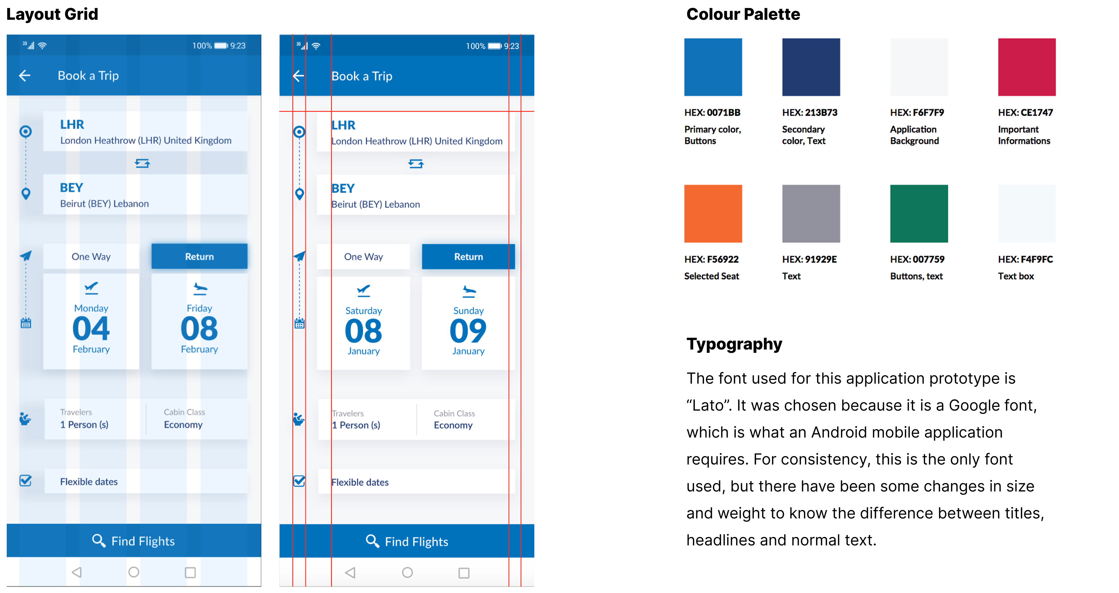
The logo was the one piece of brand that did exist and was not up for debate, so I took the palette and the character from it and built outward: a primary blue for actions, a deeper secondary for text, and specific colours doing specific jobs: one for important information, one for a selected seat, one for buttons.
That gives every colour a reason to exist that somebody at MEA can check, which is what makes a style guide survive contact with a client.
Design a fresh visual style, since there were no guidelines constraining it.
Extracted the palette from the logo and assigned each colour a defined role in the interface.
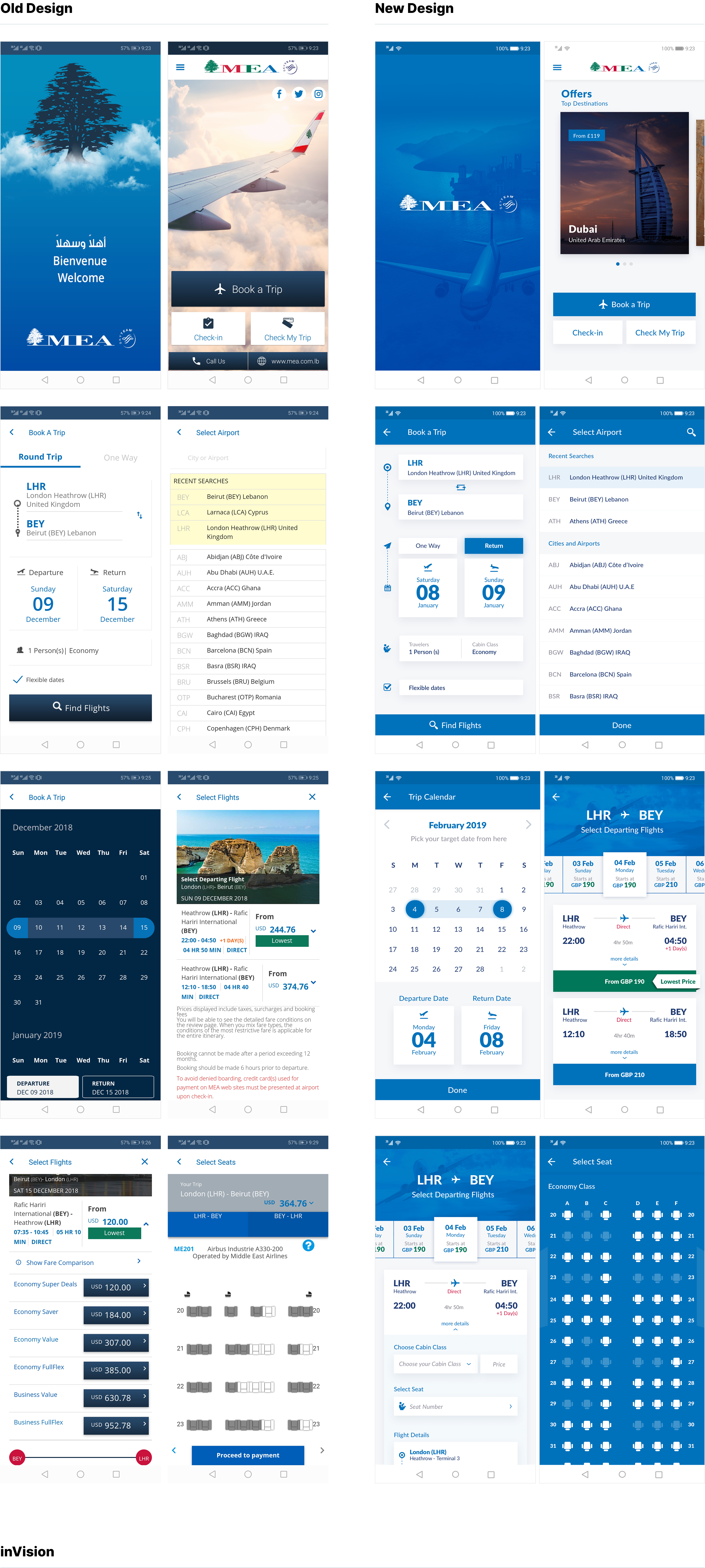
Old design, new design.
The redesign answers the findings directly. Flight details, cabin class and seat selection move into one continuous flow, so the information participants expected to find inside booking is inside booking. The seat map is redrawn at a size a thumb can actually use. And the home screen leads with destinations, because the traveller being courted here has not decided where they are going yet.

What I'd do differently.
I would test the redesign. The study produced a rigorous picture of what was wrong and a prototype that answers it, but the loop is only closed when the same tasks are run against the new design and the seat selection problem is measured again rather than assumed fixed. A SUS score before and after would have made the whole project’s value arguable in one number.
I would also push harder on the third finding. Participants left the app for the website to read about Lebanon and told us they would rather not have to. That is a destination-content opportunity for an airline trying to sell a country as much as a seat, and I treated it as a menu item rather than the strategic question it probably was.